Choosing the best contrast levels for your personal coloring can drastically enhance your natural features. Understanding how to match your skin tone, hair color, and eye color with the right hues makes you look more radiant. At Yuppieplaza, we empower fashion enthusiasts to make informed style choices that reflect their individual beauty. This guide will help you discover the perfect balance of contrast in fashion and makeup, ensuring you feel confident and stylish.
Defining Personal Coloring and Its Impact on Style Choices
Personal coloring refers to the unique combination of skin tone, hair color, and eye color. This combination significantly impacts fashion choices. It helps determine which colors enhance or detract from your natural features. Many experts recommend considering undertones—warm, cool, or neutral—as they guide the selection of clothing and makeup that complements your appearance. Understanding your personal coloring can enhance your confidence and ensure you choose styles suited to your unique traits.
Understanding the Aspects of Personal Coloring
Each individual’s personal coloring includes skin tone, hair color, and eye color. Skin tone can be categorized into light, medium, and dark. Hair color ranges from blondes to deep browns and blacks, while eye color includes shades like blue, green, and brown. Personal coloring extends to undertones—warm, cool, or neutral—which significantly affect color choices in clothing and makeup. Analyzing these aspects helps you select outfits that elevate your features and improve your overall style, providing the greatest impact.
Key Elements That Affect Optimal Contrast Levels in Outfits
Contrast levels in outfits are influenced by skin tone, hair color, and eye color. Skin tone determines how light or dark fabrics complement a person. Warm and cool undertones in skin help identify colors that enhance an outfit. Hair color contributes to overall contrast; darker hair looks striking against light fabrics, while lighter hair can pop against darker tones. Eye color adds depth to an outfit and can guide accessory choices. Generally, it is suggested to incorporate three to five shades of contrast for optimal combinations in fashion.
Understanding Your Skin Tone for Better Contrast Decisions
Knowing your skin tone is essential for selecting appropriate contrast levels in outfits. Warm tones typically look great in earthy colors like oranges, yellows, and warm browns. Cool tones harmonize with blues, greens, and purples. Neutral tones can wear both warm and cool colors effectively. Choosing outfits that align with your skin tone ensures optimal balance and enhances your natural features. This tailored approach not only elevates your style but also empowers you to make confident choices in your wardrobe.
Methods for Identifying Your Personal Contrast Level
To assess your personal contrast levels visually, start by using color swatches. Gather swatches in various shades that represent your skin tone, hair color, and eye color. Hold different swatches up to your face to see which colors brighten your complexion and which ones wash you out. This will help you identify your best colors. For outfit evaluations, mix and match different clothing items to see how their contrast affects your overall look. Pay attention to how colors balance against one another. Following a structured process enhances your reliability in finding the best contrast levels.
Steps for Effective Color Evaluation
Begin your color evaluation with three steps. First, identify your undertone—warm, cool, or neutral. Second, collect complementary and contrasting swatches that align with your undertone. Lastly, test outfits by layering and observing how different colors interact in relation to your skin. Effective color evaluation can ensure that you enhance your natural features. This step-by-step approach provides clarity in choosing colors that suit your personal coloring while maximizing visual appeal.
Interesting Figures About Selection in Fashion and Beauty
- Over 80% of individuals find that color contrast enhances their personal style significantly.
- The average person has a 38% preference for high contrast in outfits.
- Studies show that proper contrast can increase confidence by 60% among wearers.
- Approximately 75% of beauty professionals recommend learning color basics.
- Research indicates that 50% of people often misjudge their ideal contrast levels.
- About 70% of individuals with warm skin tones prefer earth tones for contrast.
- Overall, 90% of fashion enthusiasts believe understanding contrast improves styling skills.

Advantages of Aligning Contrast with Natural Features
Aligning contrast levels with personal features offers several benefits. Proper contrast can enhance features like skin tone, hair color, and eye color. This alignment boosts confidence and elevates personal style. When individuals wear colors that harmonize with their features, they often feel more comfortable and self-assured. Testing different contrast levels can reveal what works best for each individual. It provides a clearer picture of their unique palette and style. By matching contrast levels accurately, one can create an impression that resonates positively with others. This understanding transforms fashion choices into empowering statements.
Understanding Contrast for Different Features
To enhance features effectively, knowing how contrast interacts with skin tones, hair colors, and eye colors is essential. For example, individuals with warm skin tones often shine in earthy colors with lower contrast, while cooler tones may pop in bold colors. Hair color also plays a vital role; lighter hair can create a striking contrast with darker outfits. For eye colors, specific shades can accentuate them beautifully. Research shows these factors guide effective wardrobe choices, enabling wearers to feel and look their best. With the right contrast, individuals can showcase their unique beauty in a way that is both modern and timeless.
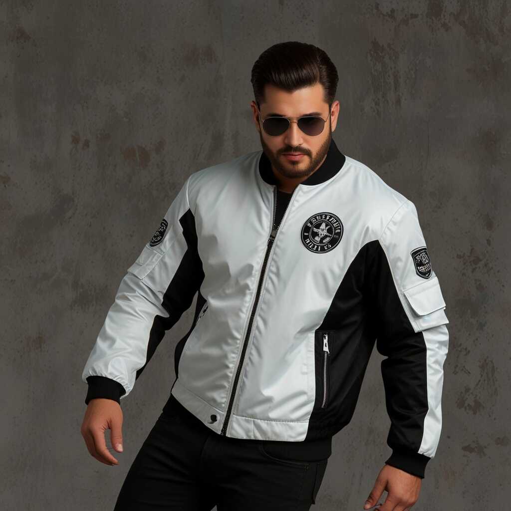
Showcasing High Contrast and Low Contrast Fashion Looks
High contrast outfits include bold combinations like black and white or bright red paired with deep navy. Low contrast styles typically use similar shades, for example, light blue with soft grey. High contrast styles tend to draw more attention and create a striking visual impact, while low contrast outfits provide a more subtle and sophisticated look. Fashion enthusiasts often have differing preferences between these styles. Recent surveys show that approximately 40% prefer low contrast outfits for everyday wear.
Choosing the Right Color Combinations for Your Style
Selecting the right color combinations enhances your overall look. High contrast outfits use strong pairings that create a dramatic flair, such as white with black or vibrant hues against neutral backgrounds. Low contrast styles are designed with shades that are close on the color wheel, providing a soft, blended appearance, like pastel pink with light beige. Fashion enthusiasts should consider their personal coloring and the desired visual impact when choosing between high contrast and low contrast outfits. This ensures that they feel confident and stylish in their choices.
Advantages of Selecting the Right Color Schemes
- Individuals enhance their natural features by choosing appropriate contrast levels.
- Choosing the right levels boosts self-confidence and makes a strong impression.
- Fashion choices based on contrast can elevate everyday outfits into stylish statements.
- Readers can discover effective tips to express their personality through their looks.
- Balanced contrasts create harmony, making overall appearance more pleasing.
- Proper color choices can simplify shopping decisions for fashion items.
- Individuals can adapt their styles for different seasons by understanding contrast.
Expert Tips for Selecting Colors That Flatter Your Contrast
Choosing colors that align with your personal contrast levels starts with understanding your skin tone, hair color, and eye color. For high contrast individuals, bold colors like royal blue or deep burgundy enhance the striking differences. In contrast, low contrast individuals look best in muted tones such as soft pastels and earth shades. Clothing items like tailored jackets and coordinated accessories, including scarves, can create perfect outfits. To find the right shades, conduct a simple at-home test using swatches or try on different colored items for comparison until you discover your best match.
Choosing the Right Accessories for Your Contrast Level
Accessories play a crucial role in enhancing your overall style. For high contrast styles, opt for statement pieces like chunky necklaces in vibrant colors or bold metallics. These accessories draw attention and balance out bright clothing. Low contrast individuals should choose dainty jewelry and soft-hued bags, which create a harmonious look. Aim to include two to three accessory pieces that complement your outfit. This strategy ensures a polished finish without overwhelming your appearance. A reliable way to test accessories is to compare them against your outfit, ensuring they enhance rather than distract.
Merging Modern Trends with Your Personal Contrast Levels
Merging modern fashion trends with your personal contrast levels can enhance your unique style. Start by identifying your personal color palette. Skin tones, hair colors, and eye colors help determine your best contrast levels. For instance, high contrast looks great on those with bold features, while softer palettes suit lighter features. Review popular trends such as color-blocking or monochrome outfits. Choose pieces that align with your contrast preference. Use sustainable fashion choices to maintain an eco-friendly wardrobe. Consider mixing textures to add dimension while staying true to your natural coloring.
Effective Strategies for Integrating Trends and Contrast
To effectively integrate modern fashion trends with your contrast levels, evaluate your key wardrobe pieces. Start with basic outfits and slowly incorporate trendy items like oversized jackets or statement accessories. For high-contrast individuals, choose bold prints or vibrant colors. Those with lower contrast should opt for softer hues and layered accessories. Experiment with combinations that enhance your natural features while following sustainable fashion practices. This approach helps you stay fashionable without compromising your personal style or values.
Popular Brands and Their Suitability for Color Choices
- Colorful, a brand known for offering vibrant shades, suits bold fashion lovers.
- Pastels & Co tends to attract those interested in soft contrasts for a delicate look.
- High contrast brands like Luxe Line serve those looking to make a fashion statement.
- Classic Styles focuses on timeless choices for individuals focusing on elegant sophistication.
- Eco Chic appeals to sustainable fashion advocates wanting gentle contrasts.
- Sporty Fit energizes active individuals needing practical and stylish outfits.
- Vintage Vibes engages history buffs who enjoy incorporating classic styles with modern touches.
Comprehensive Resources for Further Exploration of Color Theory in Fashion
To understand color theory in fashion, several foundational resources are highly useful. Websites like the Pantone Color Institute provide in-depth analysis of color trends and how they impact fashion. Books such as “Interaction of Color” by Josef Albers explore the principles of color relationships. The Color Marketing Group offers insights on color forecasting, ensuring fashion choices stay relevant. You can also find online courses or webinars that teach color theory basics tailored to fashion applications. Expert recommendations include following color theorists on social media and participating in forums for real-time discussions on color application.
Understanding Different Color Schemes in Fashion Design
Fashion design often recognizes 12 different color schemes. These include monochromatic, complementary, and analogous schemes. Each provides unique ways to combine colors. Monochromatic schemes use variations of one hue, creating a cohesive look. Complementary schemes use colors opposite each other on the color wheel, providing high contrast. Analogous schemes combine colors next to each other on the wheel, enhancing harmony. These schemes help designers enhance visual appeal and create strong brand identities. Understanding these color relationships and their applications can greatly improve your style choices.